What a Website Banner Film Actually Does for a Hospitality Brand: How We Made One for The Black Horse, Amberley
Many hospitality websites face the same problem: a potential guest lands on their homepage and it's likely that they already have twelve tabs open, three other properties shortlisted for this particular trip, and approximately four seconds before they decide whether to stay on this page or leave. In those 4 seconds, before they've read your menu, checked your room rates, or found your About page, they've already formed an impression of your brand.
That impression is made entirely by what they see and feel in those first few seconds.
For most boutique hospitality brands, that moment is handled by a static hero image. A beautiful photograph, professionally shot, carefully chosen. For a long time that was enough, but it isn't anymore.
The gap a banner film fills and why it matters commercially
A photograph shows a place, whereas a film makes you feel what it's like to be inside it. Whilst that distinction may sound simple, the commercial consequence of it isn't.
When a potential guest watches twelve seconds of a well-made banner film and sees imagery like the light moving across a dining room, the sound of a kitchen settling into its rhythm, a fire doing what fires do in the early evening, something happens that static image struggles to replicate: they begin to imagine themselves there. And the moment someone imagines themselves in a place, the booking conversation has already started.
This is why a website banner film is, in our view, one of the highest-impact visual assets a hospitality brand can invest in because it's the first thing every single visitor to your website experiences, and it sets the emotional tone for every decision they make afterwards.
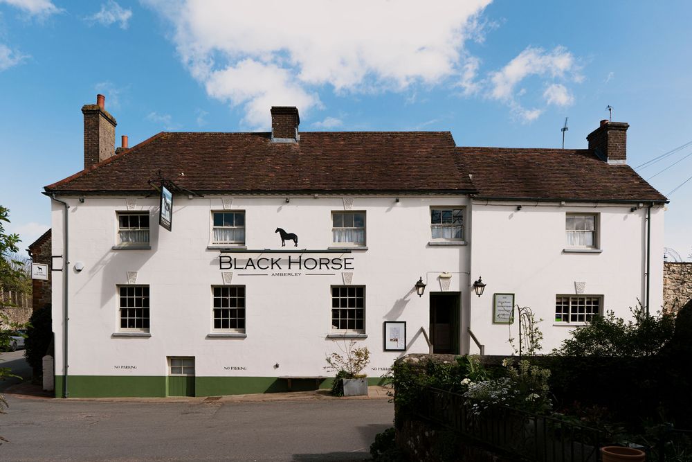
When the team at The Black Horse in Amberley, West Sussex, contacted us, they didn't have one.
The Black Horse: a brief worth getting right
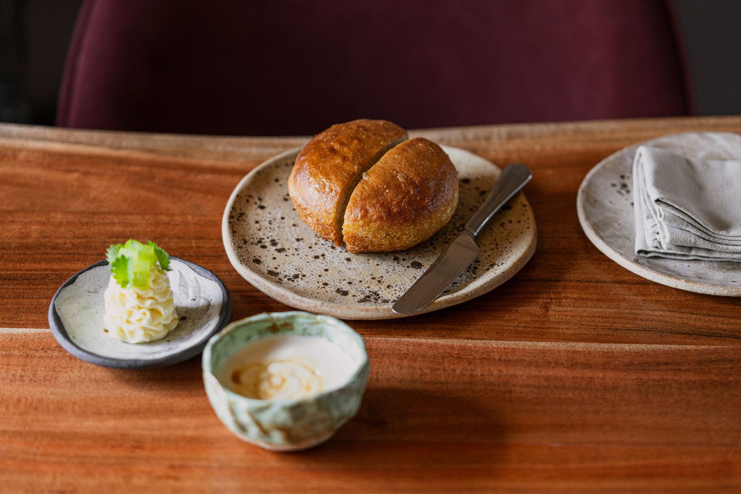
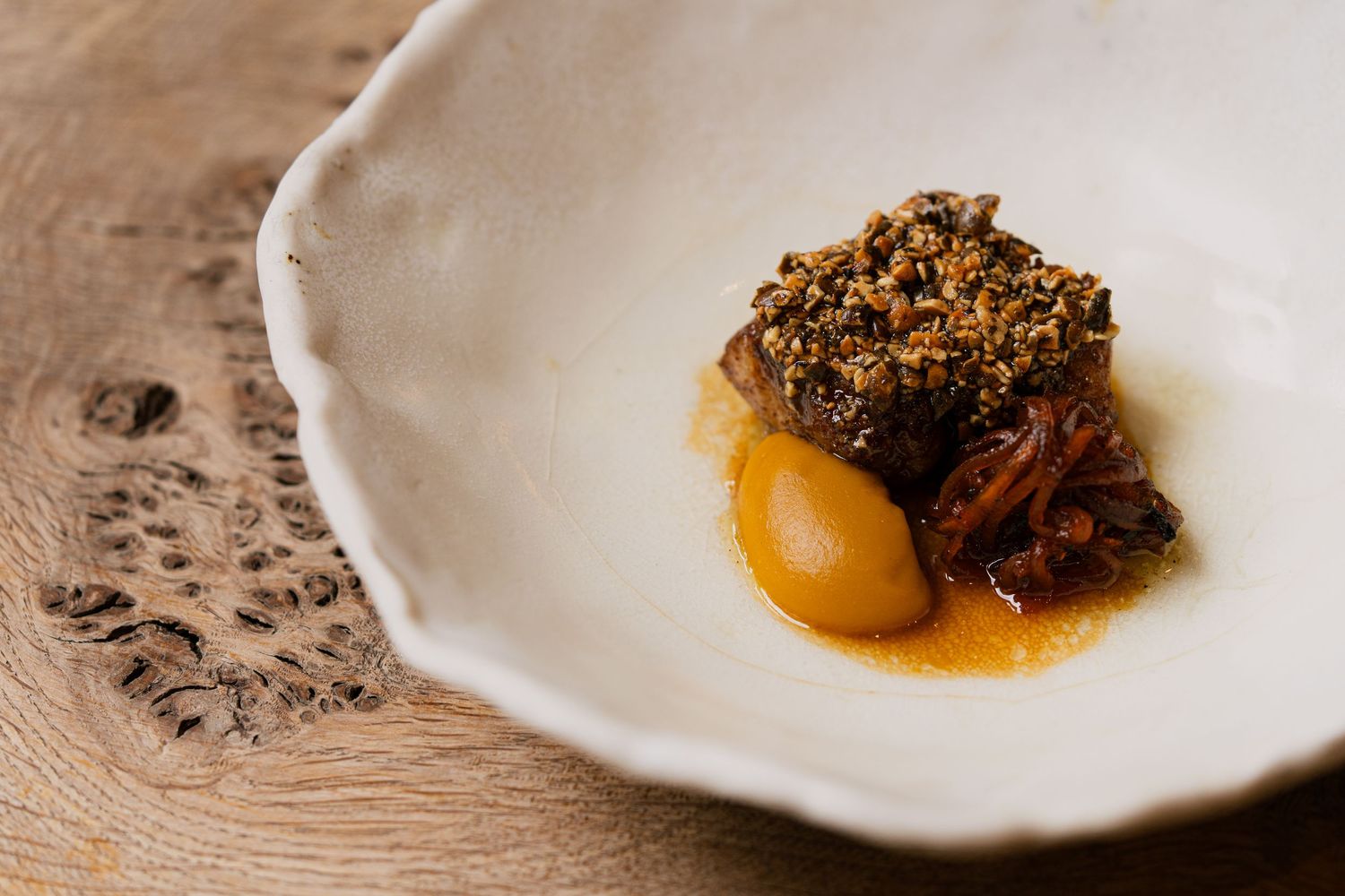
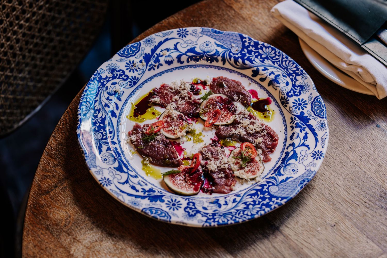
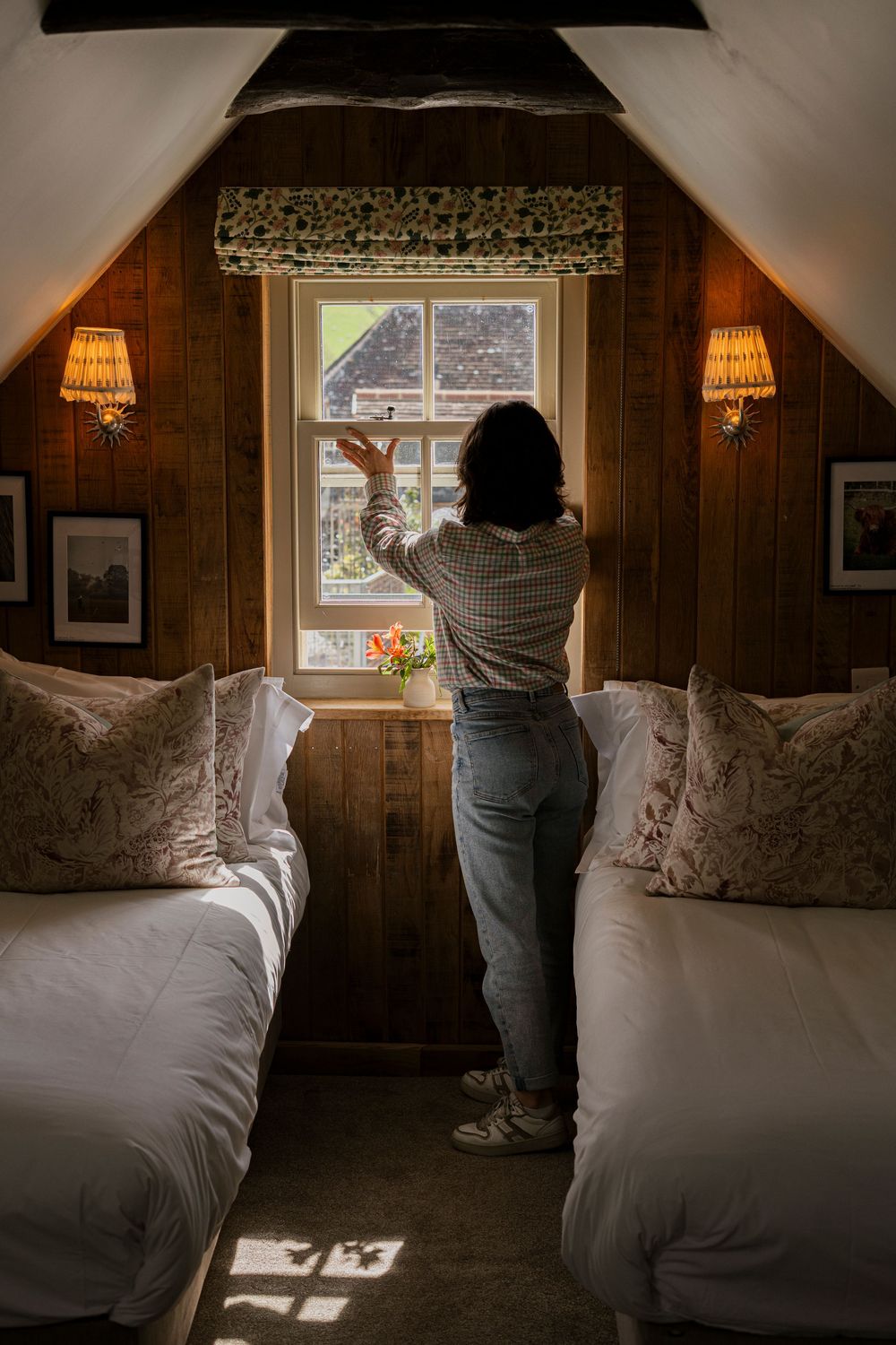
The Black Horse is a high-end pub with rooms sitting in the South Downs, with a kitchen that takes its "Local & Wild" ethos seriously. They serve seasonal menus, sourcing ingredients locally and from their own farms - it's the kind of cooking that tastes like it came from nearby because it did. The rooms designs are calm and considered, inducing a sense of being well-rested just by stepping inside and sinking into the plush armchairs. The setting is genuinely countryside and provides an atmosphere that's impossible to manufacture and very easy to lose the moment someone points a camera at it.
When they came to us, their website was carrying the weight of that brand on static photography alone. No movement or sound, no sense of what an afternoon there actually feels like.
The brief was straightforward and, in the best possible way, deliberately unspecific: capture the mood of the place. Community. Slowing down. Good food. Countryside walks. Relaxed bedrooms in the South Downs.
They didn't provide or ask for a shot list, they just wanted us to make The Black Horse feel like itself.
What we did with one day
We had a single day on location at The Black Horse. That means decisions have to be made quickly as you can't afford to spend the morning working out what the film is about. So before we picked up a camera, we spent time simply being in the space. We like to watching how the light moves in different rooms, take note of where people gravitate naturally. This allows us to understand the rhythm of the place on an ordinary day rather than a staged one.
What became clear almost immediately was that The Black Horse's identity lives in a specific kind of contrast: the quiet of the South Downs outside, and the warmth and bustling of what's inside. The light was a mix of overcast and dappled sunlight from outside set against the amber, fire-lit glow of the interior. That contrast became the visual language of the film.
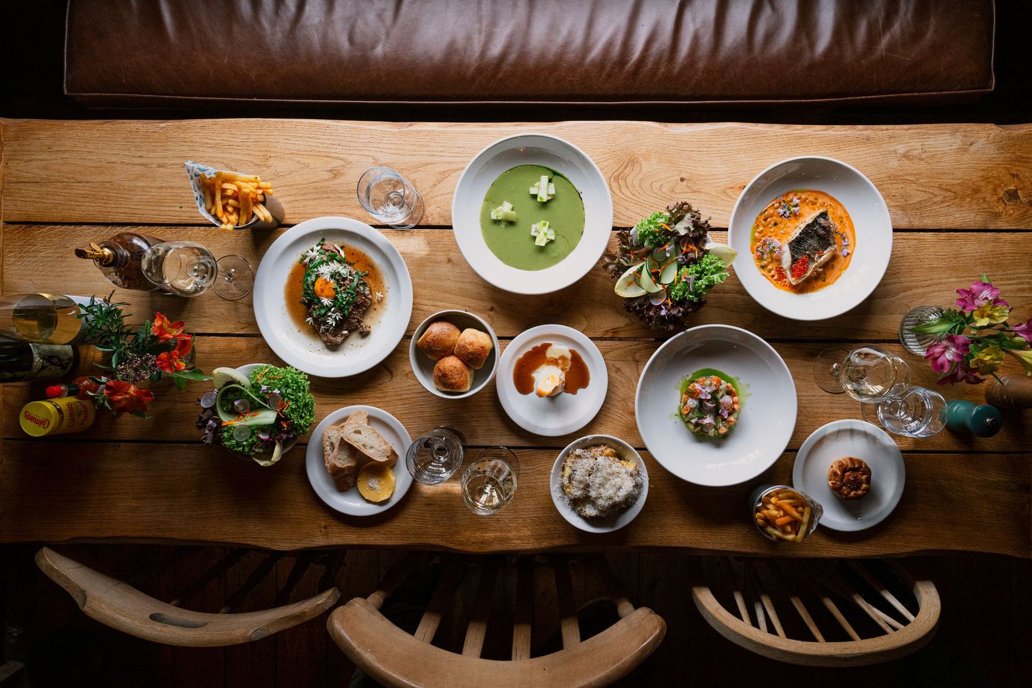
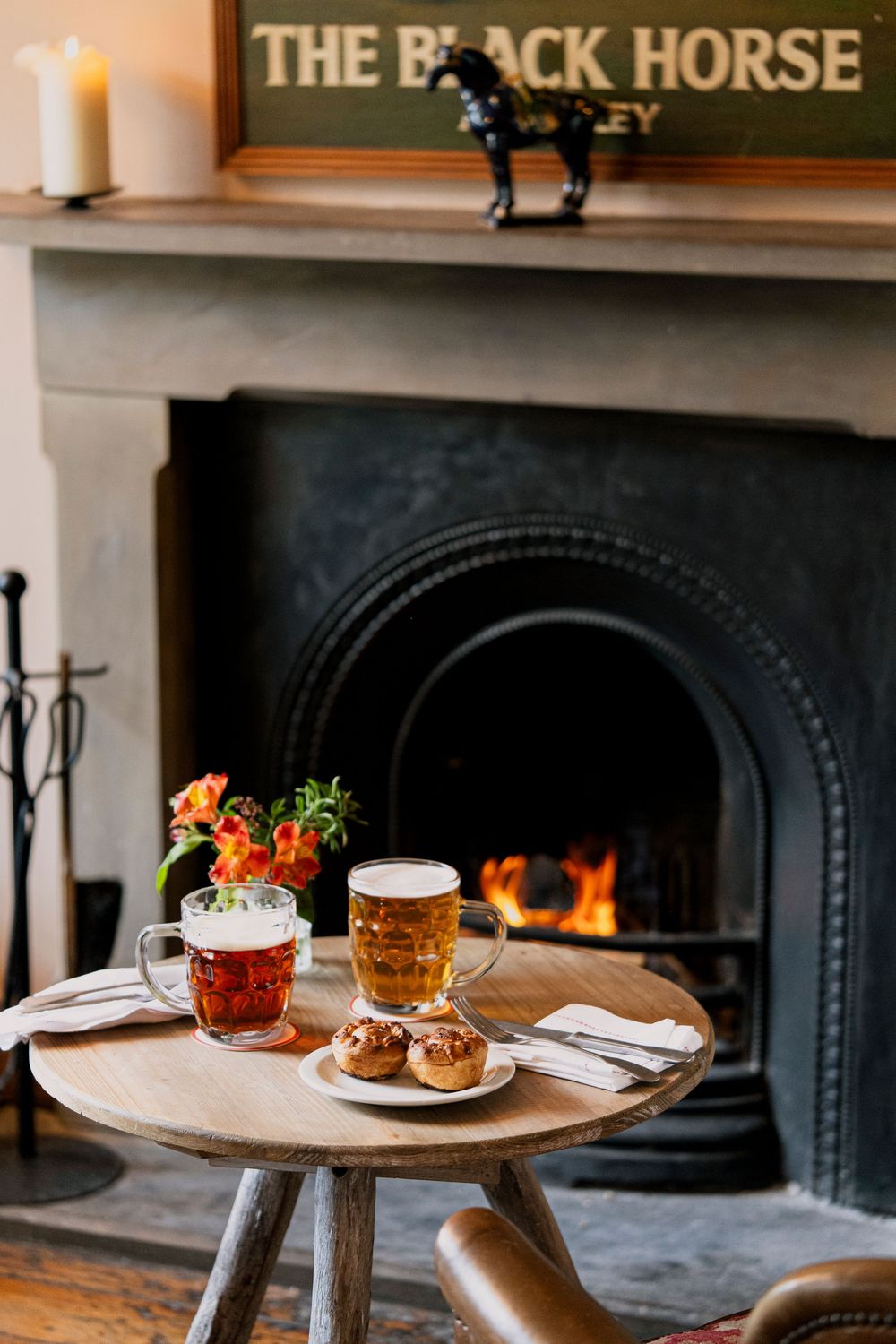
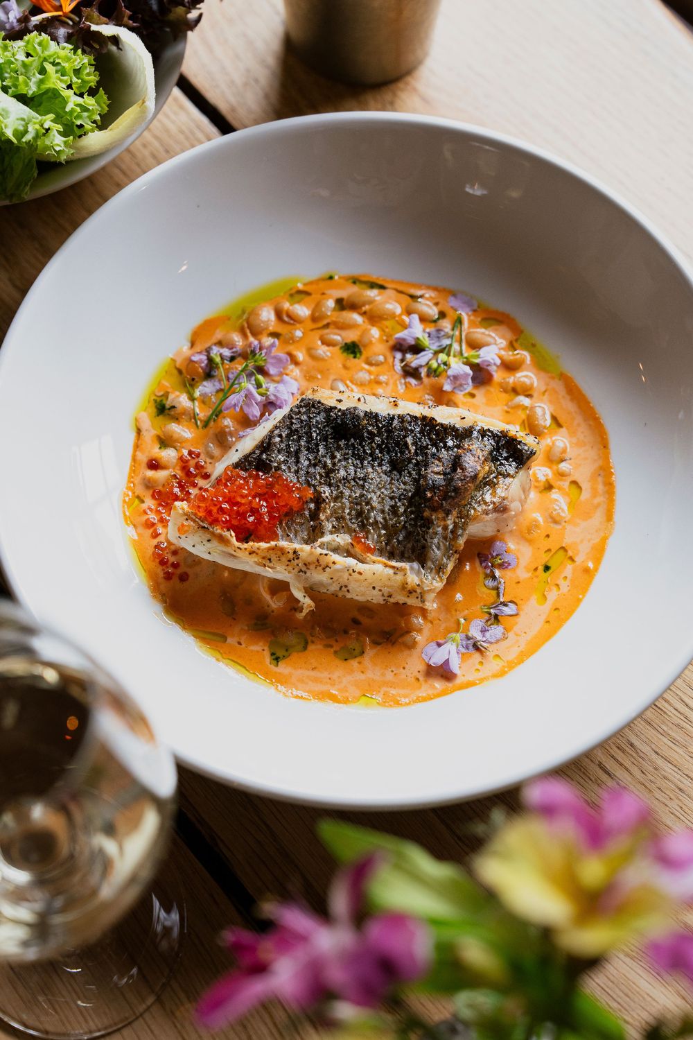
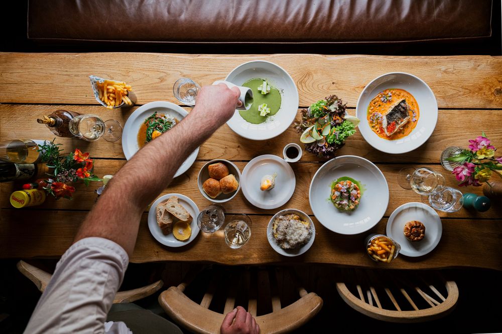
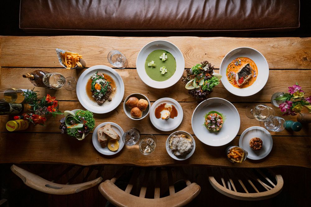
We shot the exterior in the diffused, even light that hazy days in the South Downs produce and then we moved inside, where the warmth of the interiors did the emotional work. Food shot in the natural light through windows where it came in, combined action shots using our own lights and firelight where it didn't. One area of the pub, lovingly called "The Snug" was wonderfully dark and moody, with a beautiful fireplace and a large, long window above the length of the 8-seater table. We knew this was the perfect location for capturing the scene of the table full of freshly made, seasonal dishes.
Why the pacing was a creative decision, not a default
The edit is intentionally gentle and unhurried. Fast cuts are typically easier to make feel dynamic, and a quickly edited hospitality reel with upbeat music and motion graphics is a known formula, which is why a lot of brand videos look like this. It's a safe and competent approach, but unfortunately communicates nothing specific about the brand it's supposed to represent.
Slow pacing is harder because it demands that every frame earns its time on screen. You can't hide behind movement or music; the image has to be interesting enough to hold attention without help.
For The Black Horse, slow was the only honest choice. Their brand is built around the experience of time passing at a different rate. Community and unhurried meals and countryside walks aren't experiences that can be communicated in fast cuts. If you edit The Black Horse the way you'd edit a city hotel launch, you've made a film about a completely different place.
The music choice followed the same logic: light and minimal with some ambient sound from the location sitting underneath and a track chosen to support rather than instruct the emotional response.
What the film is designed to do
A well-made banner film works across three contexts simultaneously, and understanding all three is what shapes the creative brief.
On the website: It's the emotional first impression and the thing that makes someone slow down and stay on the page long enough to book. The Black Horse film is designed to communicate the brand's core proposition (warmth, locality, genuine atmosphere) before a single word of copy has been processed.
On social: The content produced for the website doesn't have to stay on the website. A 30–45 second cut of the same film works as a reel, a story, and a collab post, making every post a touchpoint with a potential guest who may never have visited the site.
As a sales tool: When a marketing manager or events coordinator is deciding between venues, a banner film is the asset that gets forwarded internally and shown in meetings. A static image rarely makes that journey. A film that makes a room feel warm and alive does.
The Black Horse now has a visual asset that works in all three contexts, shot in a single day, built from a brief that was five words long, designed to make a visitor feel something before they've decided to feel anything.
The question your website banner is already answering
Whether you have a banner film or not, your website is already making a first impression.
The question is whether that impression reflects the experience you've actually built — or whether it's leaving potential guests unmoved, untriggered, unconvinced enough to click away and book somewhere that made them feel something first.
Most boutique hospitality brands we speak to know their visuals aren't keeping up with their product. They've invested in the food, the rooms, the team, the ethos — and their website is still carrying the weight of that investment on photography that was never asked to do this particular job.
A banner film isn't a luxury addition to a website. For experience-led hospitality brands, it's the most direct line between what you've built and why someone decides to book it.
Your website's first impression is made before anyone reads a word. If yours isn't doing the work it should be, we'd love to talk!